Keepin' It Real
A Suitability Analysis for the location of Mother Earth Organics in Los Angeles County
By
Corey Rozar
Drake Hebert
Gwendolyn Thorn
Introduction:
Los Angeles is a city focused on health, and this focus manifests itself in consumer food preferences. Local organic food is the new trendy purchase, “local” appealing to consumers as a greener option and “organic” appealing as greener and healthier. With this in mind, it makes sense to establish an organic farm in Los Angeles County to service the nearby population. Organic produce, because of the lack of preserving chemicals, does not travel far distances well, so having farms within the county make for a better business model than importing the produce from another area. Thus, determining the prime location within Los Angeles County for an organic farm, based on various factors of the environment, is a study which proves practical and worthwhile.
Before embarking on a journey into the world of organic farming, one must examine the basics for farming in LA County. According to the 2007 Census of Agriculture, there were 1,734 farms on 108,463 acres of farmland (US Dept of Agriculture). Further research revealed that, as of 2006, there were only 16 organic farms within LA County, covering a mere 111 acres (LA County Farm Bureau). That's less than 1% of both the number of farms and the acres of farmland devoted to organic produce. There's plenty of room for growth in the organic sector within LA County,
Development is not a task to be undertaken lightly, requiring an array of factors to align to create the perfect conditions. Land is not easily modified, and must undergo serious manipulations to be development-ready. Transforming stagnant land into active farmland, for example, is a change that requires foresight and planning. Before undertaking a conversion of land use, one must consider the qualities of the land and how these factors will impact the new use. When analyzing the best location for an organic farm within Los Angeles County the conditions of the land must be examined. Thus, the questions to be answered in this analysis are where is the best location for an organic produce farm in LA County, and what factors dictate this ideal location.
Before examining these factors, the requirements of organic certification for produce must be established. In 1990, the United States Department of Agriculture (USDA) created organic certification procedures in the Organic Foods Production Act. This legislation specified the preconditions of the USDA organic label, centering the requirements around two central issues. First, the food product must “have been produced and handled without the use of synthetic chemicals” (USDA). The second requirement for organic produce is that it be grown on land that has been free of chemicals for the previous 3 years (USDA). When these two conditions are met, products can earn USDA Organic Certification.
Other factors must also be considered when determining the best location for an organic farm within LA County. According to Gary Hubbell, an organic-farm specific real estate broker, there are 4 central factors to note in the search for appropriate farmland: soil, climate and elevation, water, and proximity to markets (Aspen Ranch Real Estate). Soils must be adequate for the proposed crop. Additionally, the best soil is fertile soil that has been dormant and not been stripped of resources. The climate of the area and the plot's elevation are also to be considered, since climate is key to what crops will flourish and elevation impacts the levels of sun and water the area receives. Water is a central component to farming, so accessibility to water as a source of irrigation is important. Finally, proximity to markets ensures a nearby location in which to sell your products, especially essential for organic produce which has a limited shelf life.
The final list of factors analyzed for land suitability were soil quality, distance from sources of run-off, land use classification, slope of the land, and proximity to streams.
Methods:
A suitability analysis was performed in order to evaluate the best location for an organic produce farm in Los Angeles County. The factors considered in the analysis included soil quality, land use classification, distance from sources of runoff, slope, and proximity to streams. The factors were reclassified into 5 categories which represented a value of suitability. The values ranged from 1-5 with 1 representing the least and 5 representing the most suitable areas.
Soil Quality (Map 1, Figure 1):
Soil is an essential component of farming, and the variety of soil has a definite impact on the success of the crop. The more organic matter in the soil, the higher the quality of the soil because the organic matter contributes nutrients to the soil which helps crops grow (Prince Edward Island Dept of Agriculture).
The soil data was compiled from soil data mart, a web site run by the National Resources Conservation Service. For Los Angeles County, the data was not all compiled together, but instead it was split into 5 different rasters which were the Edwards Air Force Base area, the Antelope Valley area, the Santa Monica Mountains area, and the Angeles National Forest area. These rasters were combined using the raster mosaic tool and clipped to the Los Angeles County shapefile. Some areas however were missing, most notably the southern part of the county which is comprised of the City of Los Angeles. This is most likely because most of this area is now concrete so a comprehensive soil survey was not possible. At soil data mart, there is the ability to generate reports about each area to get more information on the soil. In order to understand which soils were most conducive for agriculture, a report was generated from soil data mart, “Irrigated and Non-irrigated Yields by Map Unit,” which along the left side ranked the soils from 1 to 8, 1 being the best soil and 6 through 8 being unusable for various reasons. The values were reclassified into 5 categories according to their suitability for agriculture (Table 1). Highly suitable soils were reclassified as 5 whereas the least suitable soil and areas with no data were reclassified as 1.
Suitability Index Reclassification Soil Data Mart Classification
5 1 (slight limitations)
4 2 (moderate limitations, may need conservation practices)
3 3 (severe limitations that restrict choice of plants or require special conservation practices)
4 (severe limitations that restrict choice of plants or require careful management
2 5 (little erosion, but have severe limitations)
1 6-8 (unusable for cultivation), and no data
Table 1: Reclassification of Soil Data
Land Use Classification (Map 1, Figure 2):
Land use was one of the most important factors to consider when deciding the appropriate site selection for the organic farm due to laws and regulations that either allow or prohibit agriculture. Zoning policies limit the locations where agriculture is a plausible mode of use for the land.
A land use shapefile for Los Angeles County was attained through the California Fire and Resource Assessment Program (FRAP) and included the categories of reserve public/ private, agricultural public/private, working areas public/ private, urban private, and urban public. The land use types were reclassified from 1-5 based on the likelihood that farm development would be permitted (Table 2). Land classified as agricultural public/private was reclassified as 5 because it was most suitable for a farm and would most likely allow for the development of a farm. Contrastingly, reserved land was the least suitable and reclassified as 1 because it prohibits development and would require extensive policy adjustments in order to allow for the development of a farm.
Suitability Index Reclassification Land Use Classification
5 200 Ag / Sparse Res / Private
201 Ag / Sparse Res / Public
4 210 Ag / Rural Res / Private
211 Ag / Rural Res / Public
3 400 Working / Sparse Res / Private
401 Working / Sparse Res / Public
410 Working / Rural Res / Private
411 Working / Rural Res / Public
2 110 Urban / Private
111 Urban / Public
1 300 Reserve / Sparse Res / Private
301 Reserve / Sparse Res / Public
310 Reserve / Rural Res / Private
311 Reserve / Rural Res / Public
Table 2: Reclassification of Land Use
Distance from Sources of Runoff (Map 1, Figure 3; Map 2):
According to USDA standards for organic products, all organic production must be done without any exposure to chemicals, which can potentially enter the crop via runoff from nearby sources. Thus, one must ensure proper distances from sources of potential chemical runoff. The three central sources identified as potentially having chemical or otherwise undesirable runoff include landfills, non-organic farms, and livestock farms. Landfills combine unsavory combinations of waste which, after a rain storm, creates a runoff and may infiltrate groundwater supplies. Similarly, non-organic farms utilize chemicals which form runoff after a rain, and livestock farms contain animal waste which may also pollute groundwater. Ensuring there is an appropriate distance of land between these potential sources of runoff and an organic farm is essential to ensure protection of organic crops from chemical runoff.
Landfills, non-organic farms, and livestock farms in Los Angeles County were located using Google Maps and the website www.pickyourown.org. The 9 landfills, 16 non-organic farms, 8 livestock farms were geocoded in order to assign them geographic coordinates. Using the straight line distance tool within spatial analyst, the distances from the sources of runoff were calculated (Map 2). Initially, the straight line distance from each source was calculated. The raster calculator was then used to add the distances and generate a total distance raster. The values were reclassified using natural breaks into 5 categories ranked 1-5 from least to most suitable. Areas closer to sources of runoff were considered less suitable whereas areas farther away were more suitable for an organic farm.
Slope (Map 1, Figure 4):
Slope was determined to evaluate places in Los Angeles County where produce would grow best. Elevation data was attained from the USGS Seamless Server and slope was calculated with the spatial analyst tool. The slope data was then reclassified into 5 classes using natural breaks. Areas with the largest slopes were classified as 1, or least suitable, because it is difficult to grow crops on a slope due to difficulty with harvesting, maintenance, and an uneven distribution of water and sunlight. Similarly, areas with the smallest slopes were classified as 5, or most suitable, because flat areas maximize crop production as more crops can be grown per meter squared, irrigation is more efficient, and there is an even distribution of access to sunlight for all the crops.
Proximity to Streams (Map 1, Figure 5):
Water is another central feature of farming, and proximity to a source of water is crucial to the success of a farm and the preservation of funds that otherwise would have to be spent on pumping water from a faraway source. Close proximity to streams provides a constant source of water that can be used for irrigation purposes in the fields.
Stream data for Los Angeles County was attained through the UCLA Mapshare website. A multiple ring buffer was created around the streams with values .2, .4, .6, .8, and >1 mile(s). Areas closest to the streams (.2 miles) were reclassified as most suitable (5) whereas areas farther (>1 miles) were reclassified as least suitable (1) (Table 3).
Suitability Index Reclassification Stream Buffer Values (miles)
5 .2
4 .4
3 .6
2 .8
1 >1
Table 3: Reclassification of Stream Values
Final Calculation (Map 3):
Using the raster calculator, the factors were weighted and added together in order to generate values of suitability with the following calculation: (((soil quality) * .3) + ((land use)* .2) + ((distance from runoff) * .2) + ((slope) * .15) + ((proximity to streams) * .15)) * 5. The factors were weighted according to their level of importance when determining the location of an organic produce farm (Table 4). Soil quality was most important and therefore, given more weight, because it was deemed the most important factor when determining the location of an organic farm. While important to consider, physical factors such as slope and proximity to streams were weighted less because they are not as essential to organic farm location compared with soil quality. After conducting the final calculation, values ranging from 8-31 were generated. Using natural breaks, these values were reclassified into 5 categories ranging from 1 (least suitable) to 5 (most suitable).
Factor Weight
Soil Quality .3
Land Use Classification .2
Distance from Sources of Runoff .2
Slope .15
Proximity to Streams .15
Table 4: Factor Weighting
Additional Factors (Map 4):
In addition to the suitability analysis, watershed and service area analyses were performed. The watershed analysis was performed using the hydrology tools in spatial analyst in order to evaluate surface water distribution in Los Angeles County. Elevation data was retrieved from the USGS Seamless server while stream and lake data was attained from the UCLA Mapshare site. The service area was generated using the network analyst tool to gain a greater understanding of the area that the organic farm would serve given its most suitable areas. The street network used for the analysis was attained from the UCLA student drive. Palmdale was chosen as the origin for the service area because it was observed as a highly suitable area for the location of an organic farm. Additionally, a 60 minute time parameter was chosen because it was deemed a reasonable time limit without significant travel costs.
Results:
The final suitability analysis for the location of a organic farm within Los Angeles County can be seen in Map 3. When looking at the final map, a trend quickly develops. The southern part of the county is the least suitable, and as you move north the land becomes increasingly suitable for an organic farm (as indicated by the bright red shade). This is due to a multitude of factors including the largely urban landscape of the city of Los Angeles leaving little soil for growing crops, the land use classification forbidding agricultural endeavors, and the proximity to landfills making the area unsuitable for organic farms. But as one travels north away from the city of Los Angeles, the area becomes much more suitable. The best location in Los Angeles County for an organic farm is the north-eastern part of the county in the Palmdale, Lancaster, and Lake Los Angeles area. This area has the greatest amount of most suitable factors for organic farming. It has good quality soil, is close to a networks of streams, is already classified as agricultural land, is very far from sources of runoff, and is located in a flat area, all of which are the factors we choose to determine the prime organic farm location. To confirm this selection both a watershed analysis and a 60 minute service area network analysis were created. Both of the watershed and network analyses can be seen on Map 4. The watershed analysis was undertaken to see if this area actually has a suitable stream network with ample water for use with the crops. The analysis shows the northeastern part of Los Angeles County has by far the most extensive stream network in county, which would help provide water for the crops. Furthermore, we wanted to ensure that this area was economically feasible for an organic farm. The main point of our project was to find an area where organic crops could be grown locally for Los Angeles consumers, so we wanted to make sure that the crop was easily transported to market. A 60-minutes service area analysis was performed with Palmdale as its starting point (origin) as this city is centrally located within the most suitable area. 60 minutes was chosen because this amount of time is reasonable travel time when transporting farm products while ensuring that the produce is not heavily damaged en route. This service area covers an extensive area making up about half the entire county. Even better, the service area reaches all the way down into Burbank and west Los Angeles, both areas with much higher populations then the northern part of the county and therefore areas with a large market where a farmer has a high probability of finding buyers for his product. From our suitability analysis it is evident that the northeastern part of Los Angeles County is the best location for an organic farm.
Discussion:
Our analysis shows that the northeastern part of Los Angeles County is the best location for an organic farm, but there are some other factors that should be taken into account. First of all, this is a very general report meant to show the best area for an organic farm, but different types of crops require different soils, water, light, and temperature conditions. This map does not take into account the prime conditions for specific crop types because, once again, it aims to find the best location for a farm, not for area with a specific crop. However, this information is important and must be taken into account before planting anywhere. The organic certification requirement that the soil be free from chemicals for the 3 previous years was also difficult to find data for as no one has compiled the resources to do track this for any area except farmers who are already planning on starting a farm at the specific location. Our suitability analysis shows where a farmer should look to buy land, at which point he would then be forced to track down records of chemical use on the land or keep the land chemical-free for 3 years to meet this USDA standard. Finally, we could not find the location of any wholesale organic produce purchasers, which we would have included into our network analysis to further show the economic viability of our location.
Bibliography:
Paper References:
Aspen Ranch Real Estate. “The Dynamics of Organic Farming.” District of Columbia, 2009. http://www.aspenranchrealestate.com/organic-farming-dynamics/organic-vegetable- produce-farms.html
Los Angeles. LA County Farm Bureau, “2006 Los Angeles County Crop and Livestock Report.” Los Angeles, CA, 2006. http://www.lacfb.org/CR2006.pdf
Prince Edward Island. Department of Agriculture. “The Importance of Soil Organic Matter.” Prince Edward Island, Canada, 2000. http://www.gov.pe.ca/af/agweb/index.php3?number=71251
United States. Department of Agriculture. “2007 Census of Agriculture.” Los Angeles: State of California, 2007. http://ucanr.org/blogs/losangelesagriculture/blogfiles/1766.pdf
United States. Department of Agriculture. “Title XXI: Organic Certification.” District of Columbia, 2005. http://www.ams.usda.gov/AMSv1.0/getfile?dDocName=STELPRDC5060370&acct=nop geninfo
Data References:
Soil
Soil Data Mart, http://soildatamart.nrcs.usda.gov/
Non-Organic Farms
Pickyourown.org, http://www.pickyourown.org/CAla.htm
Livestock Farms
Google Maps, http://maps.google.com/maps?hl=en&tab=wl
Landfills
Sanitation Districts of LA County, http://www.lacsd.org/
Land-Use Classification
Fire and Resource Assessment Program (FRAP), http://frap.cdf.ca.gov/
Proximity to Streams
UCLA Mapshare, http://gis.ats.ucla.edu/mapshare/
Slope
United States Geological Survey (USGS) Seamless Server, http://seamless.usgs.gov/
Watershed
UCLA Mapshare, http://gis.ats.ucla.edu/mapshare/
USGS Seamless Server, http://seamless.usgs.gov/
Service Area
UCLA student drive (as provided for Geography 170's Week 8 lab)
Monday, June 7, 2010
Tuesday, May 25, 2010
lab 8
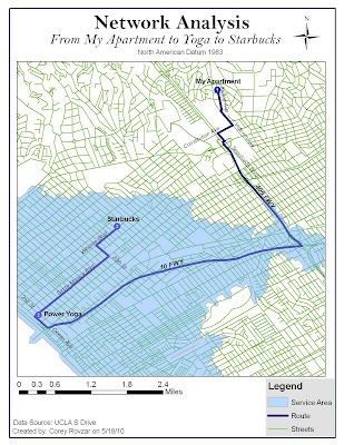
Network analysis is a tool used in both transportation and economic geography in order to analyze the allocation and displacement of places. One aspect of displacement is shortest path analysis which finds the path with the minimum cumulative impedance between nodes on a network. With shortest path analysis, there is a node of origin, destination, and possibly other nodes that act as stops along the path. Shortest path analysis allows for routes to be created based upon the shortest distance or shortest amount of time it takes to move from the origin to the destination. Allocation involves analyzing the spatial distribution of resources throughout a network in order to establish a service area. Service areas can be established based upon a time limit or maximum distance from the node. Optimal path involves finding the route with the least amount of travel costs.
For this lab, the problems in question were 1. What is the best path to take to my yoga studio and then to Starbucks? and 2. Does the studio I go to serve the area where I live? My Thursday morning route was analyzed to find the optimal route. My route includes starting at my apartment, stopping at the yoga studio, and then ending at a Starbucks on Wilshire. Additionally, the service area for my yoga studio was generated to evaluate whether or not the studio served the area where I live. The parameters for the optimal route were kept at their default values: the impedance was time (minutes), U-turns were allowed everywhere, and the output shape type was true shape. The parameter values for time included: 10, 15, 20, 25, 30, 35, 50, and 65 miles per hour. Lastly, the search tolerance was set at 5000 meters. Setting the impedance as time generated the fastest route based on speed limits. Similarly, the service area was created using default parameters: the impedance was time with default breaks of 5, direction was away from the facility, u-turns were allowed everywhere, restrictions were one way, and the parameter values and search tolerance were the same as those used for generating the optimal route. Distance units for both were set to miles. Setting the impedance as time and default breaks for the service area to 5, resulted in a service area that was restricted to areas within 5 minutes of the studio.
According to the optimal route from my apartment to the yoga studio, it is quickest for me to take Kelton, to Veteran, to Constitution, to Sepulveda, to the 405, to the 10, to Ocean, to Santa Monica, and lastly to 2nd to end at 1410 2nd St. From the studio to Starbucks, it is quickest to take 2nd, to Santa Monica, to 20th, and finally to Wilshire to end at 2525 Wilshire Blvd. Although this route should be fastest due to a higher speed limit on the freeways, ultimately it is dependent on traffic. Depending on the time that I leave, it may be faster to take side streets due to higher congestion on the freeways. The network analysis could be improved by having the capability to analyze traffic in addition to local speed limits. The service area for the yoga studio included everything that was less than 5 minutes away. Based on these results, my apartment is more than 5 minutes away from the studio. Therefore, it could be argued that it is not practical for me to drive all the way to Santa Monica for yoga when there are closer yoga studios that serve my area. However, the network analysis only accounts for travel costs and not other factors that may make it worthwhile to travel farther. The yoga studio I go to happens to be donation-based, meaning I can pay however much I have for the class without being locked into a plan. Because of this, it is worth it for me to pay the transportation costs of time and gas money to go to Santa Monica versus paying more for the classes closer to my apartment. The results generated by the network analysis would be realistic for suburban areas and small cities that don’t experience large amounts of traffic. However, for Los Angeles and other major cities, the network analysis would only really be reliable during hours where there is minimal traffic. Adding a traffic analysis component to the network analysis would increase the accuracy of the network analysis for highly congested areas such as Los Angeles.

Tuesday, May 18, 2010
Lab 7- Watershed Analysis
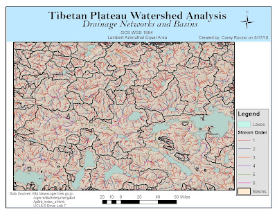
Tibetan Plateau Watershed Analysis
Introduction:
Watershed analysis is a valuable tool that utilizes digital elevation models and raster data to delineate watersheds and define features such as stream networks and watershed basins. It is an essential device in a variety of fields including hydrology and environmental modeling. An important aspect of watershed analysis is the spatial scale in which it is performed. At a larger scale, there are fewer watersheds while at a smaller scale, more watersheds are produced. The optimal scale ultimately depends on the level of detail that best suits the sample area. Factors that influence the overall quality of the watershed analysis include the quality of the digital elevation model, the algorithm used for deriving flow directions, and the threshold used to delineate the stream network. In ArcGIS, the D8 algorithm is used because it is simple, efficient, and ideal for evaluating mountainous regions. For this lab, an area-based analysis was performed for the Tibetan Plateau with watersheds created for each stream section. Analyzing the relationship between elevation and drainage networks allows for an understanding of the location of surface water such as lakes. Generating watershed analysis provides the foundational base for further surface modeling.
Methods:
The first step in delineating watersheds involved filling in the depressions within the digital elevation model. For the fill operation, a z-limit of 15 was used because it generated the most practical watershed basins with larger lakes having their own watershed basins. A denser stream network should have more, but smaller, watersheds. Additionally, using this value created watersheds that organized around stream networks and visually, made sense. The z-limit represents the maximum elevation difference between a sink and its pour point. Only sinks that have a difference in z-values between a sink and its pour point that is less than the z-limit will be filled. Using a z-value higher than 15 generated too many watersheds, while using a z-limit lower than 15 generated too few. After the basins were delineated, flow direction was calculated according to the D8 method which is the default method for ArcGIS. This method uses the 8 surrounding cells with a weighted distance to calculate the center cells flow direction. The stream network was created using the Con tool and setting a threshold of greater than or equal to 1,000 cells. The higher the threshold was set, the less detail that the map displayed because a higher threshold value results in a less dense stream network and fewer internal watersheds. While 100, 500, and 700 threshold values were tested, ultimately a threshold of greater than or equal to 1000 seemed to generate the most accurate results with stream networks clearly visible. The final steps involved creating watershed basins, which related to the fill z-limit value, and assigning a stream order to the stream networks which was based on the default Strahler method.
Analysis:
According to the watershed map, the hydrology in the Tibetan Plateau is very extensive with many stream networks and watershed basins. As a result, a large number of lakes have formed with the largest occurring in areas with the most expansive stream networks. Additionally, many of the streams contributing to the formation of lakes have a stream order of 1 suggesting that the water is flowing from a primary source to the lake and thus, more water is able to be collected rather than being diverted to other streams.
Comparison:
By comparing my map, with the downloaded data on watersheds within the Tibetan Plateau region, it is evident that my map is more detailed and has greater accuracy. The data attained from the Global Drainage Basin Database was for all of Asia. As a result, it does not show as much detail for the Tibetan Plateau especially concerning lakes and stream networks. My map shows a much more extensive stream network as well as a greater number of lakes. However, the watershed basins appear to be very similar, suggesting that the z-limit I used when creating a fill was accurate. Other differences include that my map was based on an area-based watershed method while the downloaded data was based on a pour-point watershed method.
Comparing my stream network, basins, and lakes with a landsat image provided by the Global Land Cover suggested that most of the lakes accumulate at a medium elevation. As streams flow down mountains, ultimately most of the water will collect at a medium elevation because at a lower elevation, water has been diverted to other areas through other streams. Ultimately, comparing my generated stream networks and watershed basins with a landsat image allows for an evaluation of patterns of stream flow and lake formation as it relates to elevation.
Problems:
While digital elevation models are extremely useful for performing watershed analysis, the resolution and quality of the DEM can ultimately affect the results. A DEM with a high resolution might be too course to allow for topographic features to be shown and presents difficulty when creating a stream network. Similarly, a higher-resolution DEM might also generate smaller watershed areas compared to lower-resolution DEMs. DEMs must also be of good quality in order to allow for an accurate fill. The fill is one of the foundational steps for the analysis. Therefore, having an accurate fill will allow for greater accuracy in modeling the watershed. Ultimately, the best ways to eliminate problems with DEMs is to attain them from a reliable source and to run the watershed analysis on a variety of DEMs until accurate results are attained.


Tuesday, May 11, 2010
Lab 6- Georeferencing UCLA

Georeferencing is an important tool that registers a map into a GIS system by applying real world coordinates. By georeferencing a map image, the map image is assigned a specific location and spatial analyses can be performed. One method to attain the real world coordinates is to utilize a GPS system which measures the coordinates based on satellite signals. Although GPS is valuable in providing coordinates, often times it is not entirely accurate due to inherent errors, user errors, and discrepancies that arise when interacting with a GIS. Overall, it is important to evaluate these uncertainties in order to minimize their effects on the georeferencing to allow for greater accuracy.
Despite its worldwide use in a variety of fields, GPS remains a relatively recent development. As a result, signal clarity and reception have not been able to be modified to produce entirely accurate results. For example, other electronic signals or structures such as walls and windows can block GPS signals and generate imprecise coordinates for a location. Additionally, limited reception in an area would result in greater difficulty for the GPS to accurately give a location’s coordinates. Another source of error when using GPS results from its use by a user. Not allowing sufficient time for the GPS to register the location as well as not remembering the exact location where the coordinates were taken ultimately results in inaccuracies. In this lab, much of the error was human-induced due to the inability to locate exactly where the coordinates were taken on a map. In order to minimize this error, it is important to use ground control points (GCP) on corners of buildings, landmarks, or easily identifiable objects that will be easy to precisely locate on a map image. Lastly, errors arise through the interaction between the GPS and GIS. Regardless of the accuracy of the GPS coordinates, matching the locations of the GCP points on the maps with the coordinates will inevitably produce some errors as it is highly unlikely that the precise location on the map will be located. In this lab, the orthophoto used was not updated and did not have a high resolution which presented some uncertainty when choosing the location where the GCP points were taken. Additionally, the points were taken by different groups who did not always report the precise the location where the coordinates were taken.
The results of these errors were represented by the GIS as residuals which provide the difference between the entered coordinates and the fitted coordinates relative to the other GCP points. Additionally, the GIS generated an RMS (root, mean, square) score which provides a measure of the overall error within the ground control points of the georeferenced map. For this lab, the georeferenced image generated an RMS of 3.39415. Some GCP points were removed when georeferencing the map due to their extremely high residual values which greatly increased the RMS. Although it is better to have a lower RMS score, ultimately human and GPS errors have generated a higher RMS value. Most of the uncertainty is likely attributed to the fact that the GCP points were collected by different groups and therefore, the exact locations of where the coordinates were taken had to be estimated on the map. Overall, I would improve the georeferencing of this image by taking the GCP points myself and in areas, such as corners of buildings, which are clearly visible and discernable on the map. Additionally, I would include ground control check points in order to check to see that my GCP points and current georeferencing were accurate.
Georeferencing is a valuable tool that allows virtually any map to be registered in space using real world coordinates. By continuing to develop greater technologies to improve GPS as well as other locational devices, greater accuracy can be attained when performing spatial analyses in GIS. Ultimately, the easiest way to minimize error within georeferencing is to control for human-induced error and be as precise as possible when measuring GCP points as well as finding the location of the GCP points on the map.
Tuesday, April 27, 2010
Lab 4- Interpolation


Interpolation is the process by which unknown values in a dataset are predicted based upon known samples. It employs the principle of spatial autocorrelation in order to determine the interrelatedness between points, and if there is interrelatedness, it will determine whether or not there is a spatial pattern. Two types of interpolation include Inverse Distance Weighting (IDW) and Kriging. IDW is a deterministic technique that involves using a linear-weighted combination set of sample points in order to interpolate unknown values. Known points closer to the interpolated value will have greater weight, wheareas those farther will have less weight. Overall, this method is beneficial when a data set consists of many samples that capture the extent of local surface variation. In contrast, Kriging is a statistical interpolation technique that considers the distance and direction between sample points in order to evaluate interrelatedness between points and determine surface variations. A weighted average technique is used to measure relatedness between sample points and interpolate unknown values. A fixed or variable search radius is used to predict values and the surface does not pass through any of the points.
For this lab, precipitation levels for Los Angeles County were evaluated through interpolation by considering the normal precipitation levels and total season-to-date levels that were measured at various rain gauges. Both IDW and Kriging were conducted using the given parameters by ArcGIS. Based on the season normal and season total values for both interpolation maps, is evident that the highest amounts of rainfall occur in south-eastern Los Angeles while the lowest amounts are found in the far north and southern areas. However, the IDW and Kriging methods generate varying results when evaluating the difference in precipitation levels between the season normal and season total. In the IDW map, this season’s precipitation levels appear to be about average compared with the season normal, with only a few areas of either higher than average or lower than average precipitation. In contrast, the Kriging method generated more variable results with this season’s precipitation levels being greatly below average in the northwest, slightly above average centrally, and about equal to the average in the east of Los Angeles. Both interpolation methods produced surprising results because this year is an El Nino year; therefore, it is expected that there be higher than normal precipitation levels. However, the maps suggest that overall, this season’s rainfall has not been significantly higher than normal. It is important to consider that the season normal includes precipitation values from extreme El Nino years that might include unusually high values that may cause the season normal values to be skewed higher.
I believe that IDW is the best method for interpolating precipitation values for the season normal, season total, and the difference between the season normal and total because there are a significant number of sample points and precipitation does not normally vary significantly from nearby areas. Therefore, areas closest to an interpolated value are most likely to better estimate rainfall for that area and should have greater weight. Additionally, IDW interpolation passes through all the sample points, allowing for the points to influence the interpolated values, whereas Kriging does not. Kriging would not be as accurate because the spatially correlated distance and directional bias for the data set are not known. However, Kriging would be an optimal choice if we wanted to estimate error and the level of uncertainty within the interpolation. Splining would be the last method I would use for the interpolation because it creates smooth surfaces when connecting the points, and as a result, can be misleading depending on the distance between points. For this lab, splining produced negative values for both the season normal and season total precipitation levels. Because rainfall values cannot be negative, this interpolation would be confusing to a person with no understanding of the splining technique. Overall, each method has both positives and negatives. By manipulating the parameters, different patterns will be shown. Ultimately, it is up to the GIS user to decide which method is relevant to the study topic and generates spatial patterns that best simulate reality.
Tuesday, April 20, 2010
Lab 3- Slope/fuel hazard model
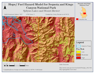
Slope/Fuel Hazard Model
Assessing fire hazards in fire prone areas is vital for fire management and prevention. Two principle factors influencing wildland fire susceptibility include slope and vegetation type, which acts as fuel for fires. Additionally, weather patterns will also influence the risk of fire. Areas with steeper slopes will cause more rapid spread upslope due to the proximity of the flame to overhead fuel. Vegetation types that are highly prone to acting as fuels for fires include shrublands and hardwoods. Lastly, hot and dry weather acting with winds can act as the igniting force to start wild fires. In the Sequoia and Kings Canyon National Park, fire is an essential component for the regeneration of many plant species as well as for maintaining the livelihoods of native animals (http://www.nps.gov/archive/seki/fire/indxfire.htm). Suppression of fire in this area has led to the accumulation of debris resulting in intense, widespread fires. In order to prevent massive fires and sustain the fire-dependent ecosystems, prescribed fires have been used within the area. Evaluating the slope and surface fuels within this region allows for an assessment of the overall risk of fire and ultimately provides a model for future wild fire management.
The study site for the slope/ fuel hazard incorporated two 7.5 minute quadrangles, Sphynx Lakes and Mount Brewer, within the Sequoia and Kings Canyon National Park. The slope was calculated for the study site and reclassified using the NFPA Model 1144 standards. This model was created by the National Fire Protection Agency to evaluate the relationship between slope and fuel and their effect on fire risk within an area According to this model, slope was classified based on NFPA hazard points: 1, 4, 7, 8, and 10. These corresponded, respectively, with minimum-maximum percent slope categories: 0-10, 10-20, 20-30, 30-40, and 40-999.The vegetation types for study site included white fir mixed conifer forest, lodgepole pine forest, barren rock with sparse vegetation, red fir forest, montane chaparral, subalpine conifer forest, meadow, other (mostly water bodies), ponderosa- mixed conifer forest, and xeric conifer forest. Similar to the slope reclassification, the vegetation types were assigned a fuel class along with the associated NFPA hazard points based on the NFPA Model 1144. The classes within this model include non fuel, light, medium, heavy, and slash, and correlate, respectively, with the hazard points 0, 5, 10, 20, and 25. The reclassification of the study site vegetation types included other as a non fuel (0), meadow and barren rock with sparse vegetation as light fuels (5), xeric conifer forest as medium (10), and all other forests as well as montane chaparral as heavy fuels (20). After reclassifying the slope and fuel types, the values were added to create the slope/ fuel hazard model. Areas with lower values (0-9) have a low burn hazard whereas areas with slightly higher values (10-19) have a moderate burn hazard and areas with the highest values (20-30) have a high burn hazard value.
In addition to evaluating slope and fuel, historic fires within the region were also displayed. By evaluating the model, it is evident that historic fires have occurred in areas with a high risk to fire. Understanding the factors behind wildfires as well as the location of past fires in the region allows for better planning of prescribed fires as well as prevention of large-scale wild fires.
Although it would be easier to display a vegetation map and a slope map, combining the two data sets by creating a slope/fuel hazard model allows for an evaluation of how the two factors interact and influence fire burn hazards in a region. By utilizing spatial analysis within GIS, models can be generated to display how environmental factors react and their impact on natural occurrences such as wild fires.

Tuesday, April 13, 2010
Lab 2- Using DEMs

Digital Elevation Models (DEMs) are commonly used in GIS to provide elevation data and permit spatial analyses for specific geographic areas. Within a GIS, spatial analyses can be conducted to calculate slope, aspect, and hill shade of a DEM in order to greater understand the terrain surface as it relates to elevation. In GIS, slope refers to the rate of change of elevation at a surface location, while aspect is concerned with the directional measure of the slope, and lastly, hill shade involves modeling the appearance of the terrain by evaluating the relationship between sunlight and surface features. The focus of this lab was to utilize a DEM to evaluate the potential risk of landslides occurring in Pacific Palisades, CA. The DEM, with its hill shade and slope, was analyzed in order to better understand the terrain surface of Pacific Palisades and evaluate the risk of landslides occurring relative to surrounding areas in Los Angeles.
In order to conduct the spatial analysis for Pacific Palisades, a DEM of the area as well as surrounding areas was downloaded from the USGS Seamless Server with 1/3 arc second resolution. The Pacific Palisades boundary was found within the Los Angeles County subdivision data that was attained from the UCLA Mapshare website. A hill shade was calculated and set with a 50% transparency behind the original DEM to show a more realistic model of the terrain surface. Additionally, slope was calculated to evaluate the dramatic changes in elevation for Pacific Palisades relative to surrounding Los Angeles areas. Lastly, data on major highways and streams and rivers were added to provide referential information of the area.
Landslides are more likely to occur in areas with a steep slope, unstable soil, high moisture content, and exposure to erosion by wave action (http://nsgd.gso.uri.edu/scu/scug73002.pdf). According to the DEM, hill shade, and slope models, the Pacific Palisades area has a high elevation with a high slope relative to the surrounding Los Angeles area. Additionally, the area contains many streams and rivers resulting in greater soil instability and thus, greater susceptibility to landslides. Close proximity to the Pacific Ocean results in exposure to wave erosion which increases the risk for landslides. While these factors do not directly cause a landslide, they contribute to the gradual accumulation of stress on the land. When a disturbance such as excessive rainfall or an earthquake occurs, the already weakened terrain surface falls along with the houses and other urban development atop. In Pacific Palisades, over 50 landslides have occurred despite efforts to reinforce the unstable soil of the bluffs (http://nsgd.gso.uri.edu/scu/scug73002.pdf). Despite the high risk to landslides, houses continue to be built and bought at high prices by individuals valuing the aesthetic value of living in Pacific Palisades. A better alternative might be to encourage greater housing development concentrated in either lower-lying cities, such as Santa Monica, or further inland areas, such as Brentwood. Diminishing the number of houses and people living on land highly susceptible to landslides will ultimately result in less damage and injuries when landslides occur.
Digital Elevation Models along with spatial analyses are important tools that allow for an assessment of surface terrain to greater understand issues such as landslide susceptibility. By cartographically displaying elevation data, places can be assessed relative to surrounding areas and solutions can be generated before disturbances and potential disasters occur. Ultimately, planning ahead and taking preventative measures are the best ways to ensure safety and prevent massive damage when landslides occur. Utilizing DEMs and evaluating their slope and hill shade provides knowledge of the terrain surface that enhances the planning and preparation to mitigate the overall damage caused by landslides or other natural catastrophes.
Lab 1- Mapping Cell Towers

In the past decade, the use of cell phones throughout the world has greatly increased as technology has continued to reformat the devices to make them more user-friendly and accessible. In the United States, about 270 million mobile cellular telephones are in use, representing about 89% of the population (The World Factbook). In order to provide cell phone reception for users, it is necessary to implement cell phone towers which communicate with each other to allow for the device to connect to the server. Server companies might include AT&T, Sprint, Verizon, etc., and each has their own towers. More populated areas will most likely have a greater number of cell phone users. As a result, cell phone towers should be located in densely populated urban areas in order to accommodate the greatest amount of users. Similarly, areas with small populations, such as rural farms, should have significantly fewer cell towers due to fewer users. Therefore, locating cell towers is important as it can give information regarding the spatial distribution of populations. Additionally, locating cell towers becomes important when evaluating the potential health effects as well as property value depreciation caused by cell tower transmissions.
In my map on the location of cell towers in Orange County, there is a pattern of the cell towers being located in more populated cities as well as near major freeways. Additionally, there tends to be more cell towers located in the more affluent regions of Orange County. Wealthier people are likely to have more cell phone use compared to lower-income individuals. In Orange County, there tends to be wealthy people concentrated near the coastline. As a result, there are greater numbers of cell towers on the coast compared to inland regions. It would be expected that there would be greater numbers of cell towers near airports due to the high volume of people within these small areas. However, based on the map, there was no pattern found for more cell towers to be located near airports.
Not only can cell tower location provide insight into the current distribution of populations, but also the emergence of new cities that will most likely experience expanding populations. When new housing developments and complexes are built, the population in that area increases. As a result, cell phone companies will seek to provide greater service to these areas and will most likely build cell towers. In Orange County, the population change from 1990-2000 was +18.1%. To accommodate an expanding population, more cell towers were most likely built. Comparing the location of cell towers each year could provide insight into the developmental history of an area as well as changes in population distribution.
Despite the desire for phone companies to increase their numbers of users, cell tower location has caused some conflict with residents. There has been some speculation that close proximity to cell towers could lead to a greater likelihood of developing cancer and other health risks. However, there has been no scientific evidence to support this claim (http://www.cancer.org/docroot/PED/content/PED_1_3X_Cellular_Phone_Towers.asp). Additional issues surrounding the location of cell towers include blocking views and devaluing property. In order to appease residents, companies will often pay rent to the property owner where the tower resides. Overall, there has been little research conducted on cell towers and health risks because they are a relatively new technology. If it is found that cell towers do produce health risks, then locating cell towers will be crucial in order to evaluate who might be affected as well as inform potential buyers of the level of exposure they will have to cell towers in the area. Because cell towers are concentrated in more densely populated areas, findings that cell towers have negative effects on health could be catastrophic and would result in the need to relocate most of the existing towers. Locating cell towers provides the first step in analyzing the potential effects that the radio transmissions can have on people living nearby.
Subscribe to:
Comments (Atom)